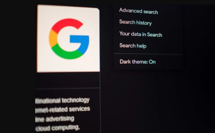
We all prefer dark mode for a variety of reasons, including reduced eye strain, energy savings for OLEDs, and its cool factor. Although Android implemented the functionality in 2019, it wasn’t until December 2020 that Google began testing it on desktop Search. The grey-coloured experience progressively extended to more users until being made available to everyone in September of last year. According to new information, Google is planning to bring a dark mode to Search that is much darker.
Digging Into Details:
According to 9to5Google, Google is testing a pitch-black dark theme (#000000 colour code) for its desktop search results pages. With a darker blue tone, the new design makes links appear more lively. Even the purple colour for previously viewed pages has been slightly changed to make it bolder.
The modification is said to have no effect on the Google.com homepage (which remains light grey) and is only available to individuals who were chosen at random for the A/B test. While the new experience isn’t yet available to everyone, the old one is still completely functional. To use the Dark theme, go to any ordinary Google search, click the Settings button next to your user profile image on the top right, go to the Appearance tab, and choose Dark theme.
What’s More?
However, a dark look isn’t the only change in the works for Google Search. We’ve seen hints of a new dynamic colour palette for image results before. The feature isn’t quite the same as Material You, which scrapes colour from your phone’s wallpaper. Instead, it’ll allegedly use the same underlying theming engine (named “Monet”) to extract colours straight from the currently shown image result.
To Conclude:
While Google has recently been attempting to improve user experience by unifying interfaces across platforms, this pitch-black dark mode is a result of the formula it has chosen. For a long time, Google has claimed that black backgrounds are more unsettling to the eye than grey backgrounds, with most of its services and apps, including Google Search on Android, opting for the latter. It’s unknown why Google reversed its decision, but the pitch-black variant is currently only part of an experiment that isn’t open to everyone, so it may never see the light of day.
References:
- https://forum.xda-developers.com/t/googles-dark-mode-goes-darker-the-new-pitch-black-theme-began-rolling-out-recently.4406527/
- https://www.androidcentral.com/google-search-pitch-black-dark-mode-web
- https://support.google.com/chrome/thread/137756904/google-chrome-darkening-dimming-my-screen?hl=en
- https://www.news18.com/news/tech/google-search-is-getting-darker-dark-mode-how-it-looks-4801244.html


