Google Chrome is a cross-platform web browser that was created by the company Google. Built with free software components from Apple WebKit and Mozilla Firefox, it was first released in 2008 for Microsoft Windows. It was later ported to Linux, macOS, iOS, and Android, and is now the default browser on all of these platforms. The browser is also a key component of Chrome OS, acting as a platform for web apps.
According to StatCounter, Chrome has a 68 percent worldwide browser market share on personal computers (PC) (after peaking at 72.38 percent in November 2018), is mostly used on tablets (having surpassed Safari), and is also dominant on smartphones, with a 65 percent market share across all platforms combined as of October 2021. Google has expanded the “Chrome” brand name to include other products such as Chrome OS, Chromecast, Chromebook, Chromebit, Chromebox, and Chromebase as a result of its popularity.
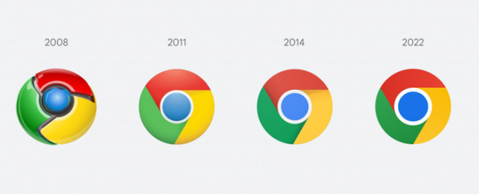
Elvin Hu, a Google Chrome designer, has shared the new Google Chrome logo on Twitter, highlighting the web browser’s small changes. For the first time in eight years, Chrome is changing its logo design. Because the alterations are so small, it’s difficult to identify the difference. Elvin Hu, a Google Chrome designer, provided the news and a sneak peek at the upcoming overhaul on Twitter. Google simplified the main icon by ‘removing shadows, improving proportions, and brightening colours,’ according to Hu.
Elvin Tweeted; “we also discovered that putting certain colours of green and red next to each other generated an unpleasant colour vibration, so we added a very faint gradient to the main icon to counteract this and make the icon more approachable.”
If you squint hard enough, the colours will appear more bright, and the circle in the centre will appear larger. “To fit with Google’s more current brand expression, we streamlined the main brand emblem by removing the shadows, adjusting the proportions, and brightening the colours,” Hu tweeted.
According to Hu, Google has also made ‘OS-specific tweaks,’ stating that the icons should “feel recognizably Chrome, but also well-crafted for each OS.” On Windows, for example, the icons are clearly gradated and appear at home on Windows 10 and 11′.
Answering the question that is most likely on your mind: “why bother with something so subtle?” Hu stated, ” “With features like Native Window Occlusion on Windows, day-one M1 support on macOS, Widgets on iOS/Android, and Material You on Android, we personalize Chrome’s experience to each OS. We want our brand to reflect the same level of attention to detail.”
Reference:
- https://www.livemint.com/companies/news/spot-the-difference-google-chrome-changes-logo-after-eight-years-11644194056989.html
- https://www.techtimes.com/articles/271484/20220206/google-chrome-change-logo-first-time-decade.htm
- https://www.tribuneindia.com/news/schools/new-logo-for-google-chrome-8-years-367551
- https://gadgettendency.com/chrome-changes-its-logo-for-the-first-time-in-eight-years/
- https://www.timesnownews.com/technology-science/article/google-chrome-gets-new-logo-after-8-years/856401


